
Petit Bateau
A French heritage label, a store that could not stop selling, and a re-platform its customers never felt.
- Client
- Petit Bateau Singapore
- Scope
- Theme migration · Gifting UX
- Platform
- Shopify
- Year
- 2026
Change everything
the customer sees.
Touch nothing else.
A live store.
A landmark brand.
Petit Bateau has dressed children (and their parents) since 1893. Its Singapore store came to us by referral with an established Shopify storefront that sold every day and a clear ask: move to a new premium theme, bring the shopping experience up to the standard of the brand's best regional stores, and do it without disturbing a single live sale.
The catalogue, inventory, pricing and customer history all had to carry over untouched. Not re-uploaded. Untouched.
Re-theming a store
that never closes.
The store ran on 28 installed apps: reviews, sync, labels, logistics. Most live in Shopify's admin and survive a theme swap; the handful wired into the storefront's code had to be found, re-integrated and tested one by one. The entire build happened on a hidden draft theme while the old site kept selling, so customers never saw scaffolding.
And this is a franchise of a French heritage house, so every decision ran through brand guidelines and a real approval chain, benchmarked page by page against the label's Hong Kong flagship store. The official brand blue, Oswald and Work Sans typography, photography in the brand's own 6:7 frame: nothing was left to taste.
That approval chain set our working rhythm: batched feedback arrived, and fixes went back the same day, often within the hour, so each review round reached the decision-makers while the last one was still fresh.
Draft theme, live store.
Feedback in batches, fixes same-day.
Made for gifting.
Petit Bateau is what you buy when a friend has a baby, so the store had to treat gifting as a first-class flow, not an order note. We studied the Hong Kong store's gift experience, then built Singapore a better one. And once the leadership team saw the pace, the brief grew: what began as a re-theme ended as custom storefront software.
Gifting at checkout
A gift option in the cart opens a picker for the brand's gift boxes, with a complimentary card insert and a personal message, priced and tracked like any product.
Colour swatches, automated
One design, three colours, one clean card. A custom engine reads the brand's own SKU pattern and connects colour variants into clickable swatches automatically, on every future upload, with a safety check running every 30 minutes. Each colour keeps its own images, sizes, stock and SKU.
Promotions, self-serve
Up to three concurrent promotional badges, scoped to a collection, in the team's choice of colour and wording, with no product tags required. New, Sale and Better Value labels run natively, replacing a paid label app and its monthly fee.
Photography, uncropped
The theme forced 2:3 crops onto the brand's 6:7 photography, cutting products off mid-frame. The grid was rebuilt around the brand's own ratio, two columns on desktop.
The brand system
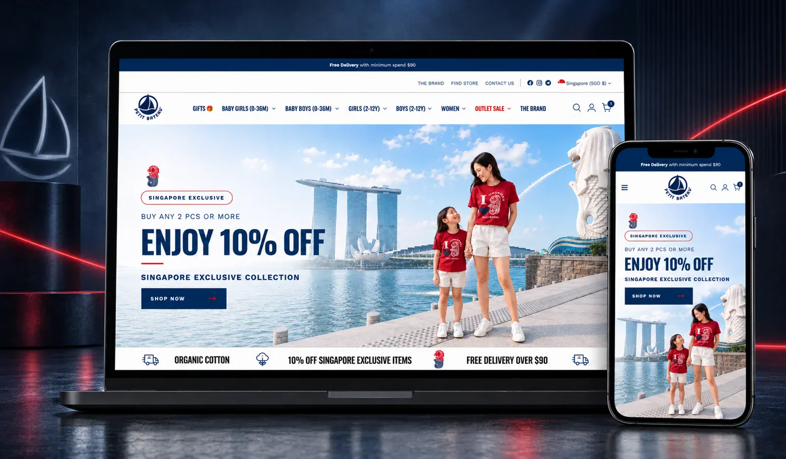
Official brand blue throughout, Oswald and Work Sans set across every template, and a homepage banner visitors can page through with arrows instead of waiting on a rotation.
Scarcity, done right
Stock counts appear only when three or fewer pieces remain, so a full shelf never reads as a slow seller. Product descriptions sit on every product page and size options show on hover.
Find a store
A dedicated store-locator page for the label's physical boutiques, ready in the navigation from day one.
Handover, properly
Two illustrated guides, one for uploading colour-grouped products and one for running promotional campaigns, so the team operates everything without waiting on us.
The store its customers were already shopping, rebuilt underneath them, live without a day of downtime.